Calligra/Meetings/End 2010 Text Styles UI IRC Meeting
Text Styles UI IRC Meeting
This is the page for the IRC meeting about the text styles UI in Calligra Words which took place on Sunday December 26, 2010, 20:00 CET in #calligra-styles-ui on irc.freenode.net. The general agenda for the meeting was to discuss/brainstorm around a new design for the text styles UI.
Discussions
(A summary of the discussions that took place follows).
The meeting started with Camilla presenting some work she's doing on the dockers. The work has implications for the styles docker, putting a two row height limit on dockers.
The two row height limit on the docker was initially met with some scepsis and questions from the other participants, but Camilla explained her rationale for the limit: freeing up horizontal space is important when working on small screen sizes; it enables the user to work at zoom levels where he/she can see an entire row while still having legible text size.
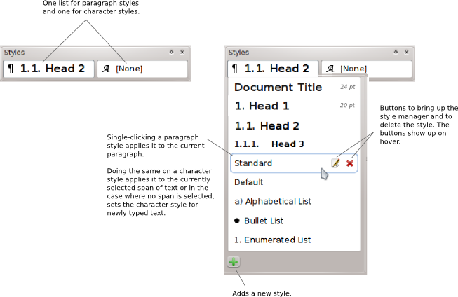
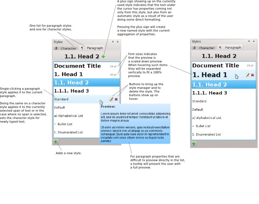
It was then concluded that there will be two styles dockers. One compact docker, where the full list of styles are available through widgets that pop up, and one traditional docker, with a full list of styles available at all times. This in order to accommodate both users who value horizontal screen real estate and users who prefer having the full list of styles on-screen at all times.
The question of whether style inheritance should be visible in the styles docker was brought up. It was decided that having the parent/child relationships between styles visible as a tree in the styles docker (which is mostly used for applying styles) brings no real value. Possibly a tree showing the inheritance could be used in the more advanced style manager.
It was also decided that the style dockers will show two lists, one for paragraph styles and one for character styles. The traditional docker and the compact docker will show this as two lists side by side (if doable) and two popup widgets, respectively.
It was agreed that the popup lists in the compact docker and the lists in the traditional docker will look similar, and the name of the style entry in the lists will be styled with the style itself, forming a preview. On hover, buttons will appear for bringing up the style manager to edit the style properties as well as a button for deleting the style. It was decided that applying the styles should be a one click operation.
Regarding automatic (non user-named) styles, it was decided that they will not be shown to the user as regular styles in any way. Instead, if the current text is formatted with properties coming from both the current paragraph style and an automatic character style (through user direct formatting) the current paragraph style will be decorated visually with a "+"-button to indicate this. Pressing the "+" button will create a new paragraph style with the properties of the current text.
When it comes to adding completely new styles, it was decided that in the traditional docker, there will be an add button below the lists, while in the popup lists in the compact docker, there could possibly be a last entry in the list saying "+ Add new".
Elvis jokingly suggested that there should be a "hacker friendly" way of applying styles; a keycombo that brings up a type-ahead searchable list of styles as a popup widget at the cursor location. Camilla noted though that we should have a way to apply styles only by keyboard, so perhaps this option can be explored further at a later time.
As Camilla was going to start working a bit on the preview part, she asked for comments on how previews should look and behave. It was decided that as many as possible of the paragraph and character properties should be shown in the direct preview in the lists of styles, but that for some paragraph properties which will be hard to visualize in the constrained space, a larger preview showing all properties will be available in a tooltip. It was also decided that for font size there will have to be a limit on how big the preview will be, otherwise entries in the styles lists will be too big.
rebottle
Another reason why a traditional high list is not a good idea, is that it takes up a lot of vertical space. Space that could be well used by other dockers. Such a high list would force the user to minimize and/or open and close dockers all the time, making the reason for a permanent docker irrelevant.
Conclusions
Below are some preliminary mockups of the new UI.
Compact Docker
Big Docker
IRC log
A full log of the IRC conversations during the meeting can be found here.


