Krita/Filters Dialog
The current situation
The current dialog for filters configuration only display a small preview widget and do not benefit from the full size of the screen.
Ideas
Non modal dialog
One solution is to take the current dialog, remove the preview widget and disable everything in Krita but the pan/zoom tools.
One possibility with horizontal dialog:
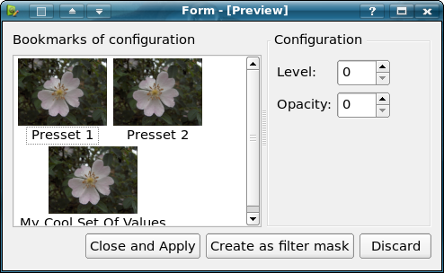
- the user select a filter in the menu, and only the bookmark and configuration dialog appears:
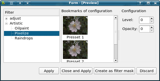
- the user select the filter gallery, and the dialog appears with the list of filters (it doesn't appears in mockup, but the list of filters also include a preview):
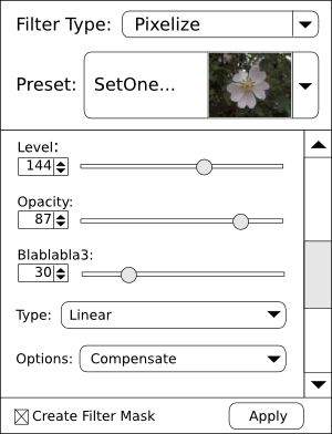
A vertical dialog has been mocked-up by Ronan Zeegers:
Docker
An other idea is to use a docker, it can be either vertical or horizontal.
Horizontal docker
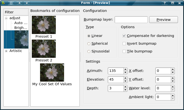
The horizontal docker might have three columns, one with a list of filters and a preview organized in a tree to follow the filter menu hierarchy. The second column will contains a list of bookmarked configuration with a preview.
And last but not least, the third column will contains the configuration widget.
 File:Krita-filters-dialog-bottom-docker-noise.png
Vertical docker
Last idea is to have a vertical docker with the only the configuration widget. The bookmarked configurations and the filter gallery could then appears as poppup button.
The vertical docker could appears and hide other dockers, the problem is that some other dockers are usefull like the overview docker or even the layerbox.
Issues with dockers
There are two issues:
- layout of configuration widget
- users don't like apply-like buttons in dockers
Filter tool
There could be a filter tool, which could either be triggered in the toolbox or through the filter menu. Then options would appears in the toolbox option. And the filter could be autoapply when the tool is unselected.
Issues with filter tool
- the filter painting tool has cause a problem because
- autoapply when the filter tool is exited is problematic if the user wants to use the pan or zoom tool
Solutions
This section is meant to present solutions that were try, and to list their problem (the goal is to avoid what we did in 1.x when trying different solution for the preview widget and then retrying older solution and then looping over solutions).
Non-modal dialog
With this dialog, all the tools are available and all the docker, that means the user can play with the various parameters of the filter, and zooming / panning, layer visibility but also painting.
The dialog will appear like the vertical dialog.
Only one dialog remains, meaning the user select a filter from the menu, and then it is seleced in the filter gallery, and all filters trigger the dialog (even those without configuration).
Launching the filter gallery will select the last filter and have the same layout that filter dialog selected from the menu.
The various buttons will do:
- "Discard" (could be called "Cancel" in fact) exit the dialog and do no change to the image
- "Create as a filter mask" enabled for filters which allows it, and well its for the non-destructive people
- "Close and apply" transform the pixel and
- "Apply" transfrom the pixel and don't close the dialog, usefull in the filter gallery for someone retouching his pictures, he might want to select different filters


