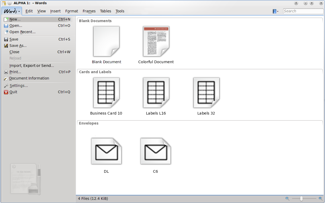
Calligra/Usability and UX/Common/Startup/Startup view integrated with the File menu
Started by Jstaniek 20:41, 14 January 2011 (UTC)
Known Issues
- UX of the KOffice 2.3 (and Calligra 2.4 alpha) Startup view is low:
- Misplaced thumbnails (e.g. in Words)
- oldish icons used as template previews (e.g. in Words)
- Usability of the Startup view is better but there's a lot to improve too
Questions
These may or may not be issues, depending who you ask. Let's decide on these.
Q0: Shouldn't we agree that the main UX these days is web browser?
(asked by jstaniek)
- If so, adjusting some of our UI elements may help to improve UX (the apps will have more modern feel) and Usability (users will discover functionality easier)
- Quick check list: remove modal dialogs if not really necessary. This is laborious task of course can be rewarding.
- Mockups on this page use these ideas.
Q1: "Always use this template" has problems
(asked by jstaniek)
- Once it's set on, the startup view disappears on another startup. Then user has to find completely different place to switch the
- It's the same problem as with the "The “Do not ask again” check box" of message boxes. See notes by Aurélien (section "The “Do not ask again” check box").
Q2: The meaning of the File Menu versus the startup screen
(asked by jstaniek)
- Are the two objects really different? They share a number of elements
Q3: The list of recent documents is now linear. How about adding grouping?
(asked by jstaniek)
- by places (directories/urls)
- by access date
- (enter your idea)
- Example: MSO 2010 has some groupping by folder [1]
Q4: We have deep search feature in KDE already. Use it.
(asked by jstaniek) Let's insert search entry in the the Recent Document part of the startup view and focus it by default. How about checking usability of this?
- Rationale: Users may remember only part of the document name.
- Rationale: Users may think they remember the document name but in fact they remember the name _inside_ of the document (e.g. heading or title) while the filename is highly random.
- Rationale: Document names can be misleading. User have troubles naming documents, if the name is created by them, they look like "Document.odt" or "2011.odt"; if the name is created automatically by the app based on the first paragraph or heading, user does not record the name, since the name can be created just befor closing the application, the name created this way can be not representative for the real content of the document.
- Rationale: Familiarity. Search box is the most used tool to locate information, more than browsing GUIs.
- Discussion: But KDE has "nepomuk search" text entry elsewhere. It does not break.
- Idea: display results in real time; sort multiple results by access/modification time.
- Technical Discussion: What if the strong KDE search feature is not available in given installation? (for whatever reason: because is broken or not installed or disabled intentionally) At least fall back to searching through file names, document properties of the recently accessed documents. Extract this information when accessing the file, check if the file changed (if so, update the cache entry). This all should be cheap for desktop systems.
- Setings menu has unclear application, since it has "configure toolbars/shortcuts" and "show toolbar" commands.
- All of them are irrelevant for the available startup actions.
- Displaying toolbar at startup adds redundancy
- TODO: Mockup
Mockups
(jstaniek)
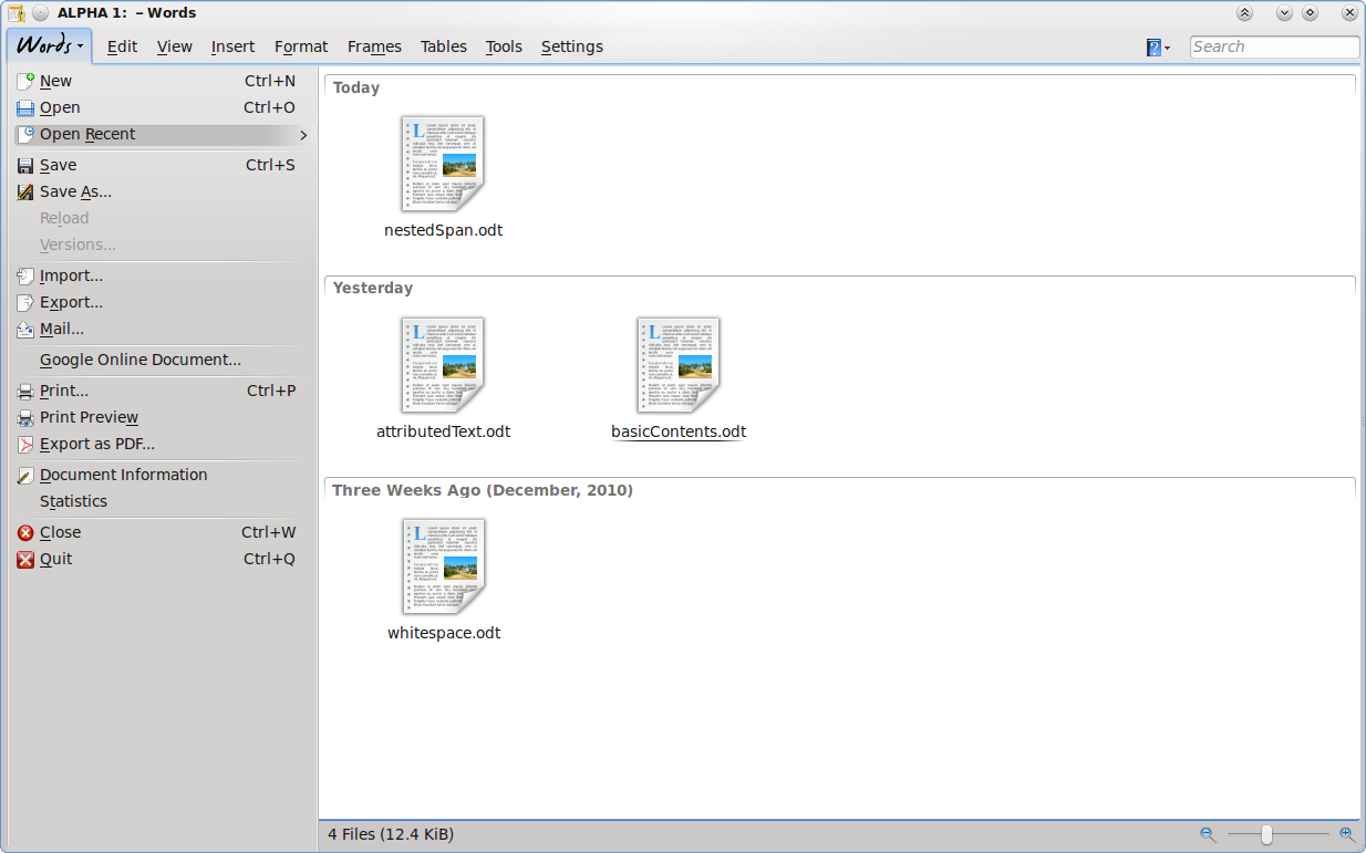
- The mockup takes Words as example, shows the view displayed on top of already opened document
- The GUI intentionally differs from the traditional KDE's main window style (which stays unchanged functionally since KDE 3, 9 years)
- The QStyle look and feel is preserved though
- It's menu-like
- Always displayed at startup, and is always accessible in the same way as menu item
- This solves issue with "never show again" setting - the setting is no longer available
- Merging the startup view with menu removes redundancy between "open", "new", etc. actions duplicated in both places (look differently, require double learning and additional muscle memory)
- Can be closed as any other menu, by clicking the "Words" emphasized item
- The "Words" item allows to display branding
- that's idea seems to be ahead of what FOSS competition does and can do; e.g. LibreOffice just displays startup dialog that looks out-of place
- Default new empty document can be always accessed for immediate editing after hiding the startup view, it's just covered by the startup view
- That's from user's perspective, technically, some delayed loading can happen
- The mockup takes Words as example, exactly as in proposal 1
- Compared to proposal 1, the menu has been simplified:
- Usability has been improved since user has 12 entries instead of 18, as follows:
- "Import", "Export", "Mail" commands groupped in single "Import, Export, Send" command, it will display page with functionality of the three commands
- "Google Online document" command moved to "Open" command, it will display page for opening of any kind
- "Print", "Print Preview", "Export as PDF" moved to a single command "Print"
- Proposal: perhaps "Export as PDF" should be offered both on "Import, Export, Send" page and "Print" page, because it belongs to both
- "Statistics" command moved to "Document Information" page
- Proposal: "Versions" command shall be moved e.g. to Tools main menu; on the mockup it's removed
- Usability has been improved since user has 12 entries instead of 18, as follows:
- UX has been improved since items are grouped as follows: frequently used commands (open/save/close/reload) are on top so it is easier to reach them using the mouse pointer
- Proposal: how about having save commands on the top? opening is less frequently used than saving.
- Settings were moved here from main menu; it is still meant as submenu with all possible settings (shortcuts, application settings, and settings for plugins/modules, like)
- Having it here gives more space for presenting settings than individual dialogs and requires fewer clicks for someone who wants to browse through all settings
- Note about shortcuts
- Pressing a shortcut associated with action from the Words menu, shows consistent reaction: first displays the menu, selects the action's item and displays appropriate page, e.g. for Ctrl+O selects "Open.." item and displays "Open" page
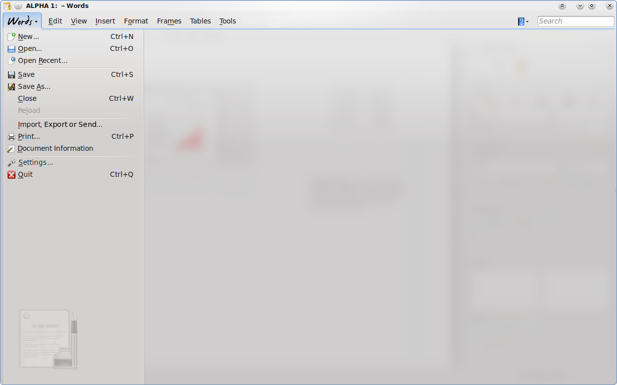
2.1: When user clicks the "Words" button, this page appears, covering the document:
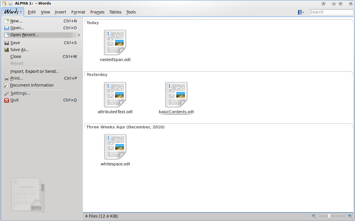
2.2: When user clickd "Open Recent" command, "Recent Documents" page appears.
- It uses the same or similar component as the Dolphin file manager, thus offers groupping by access time.
- I added search entry at top-right, like in modern browsers and mail clients
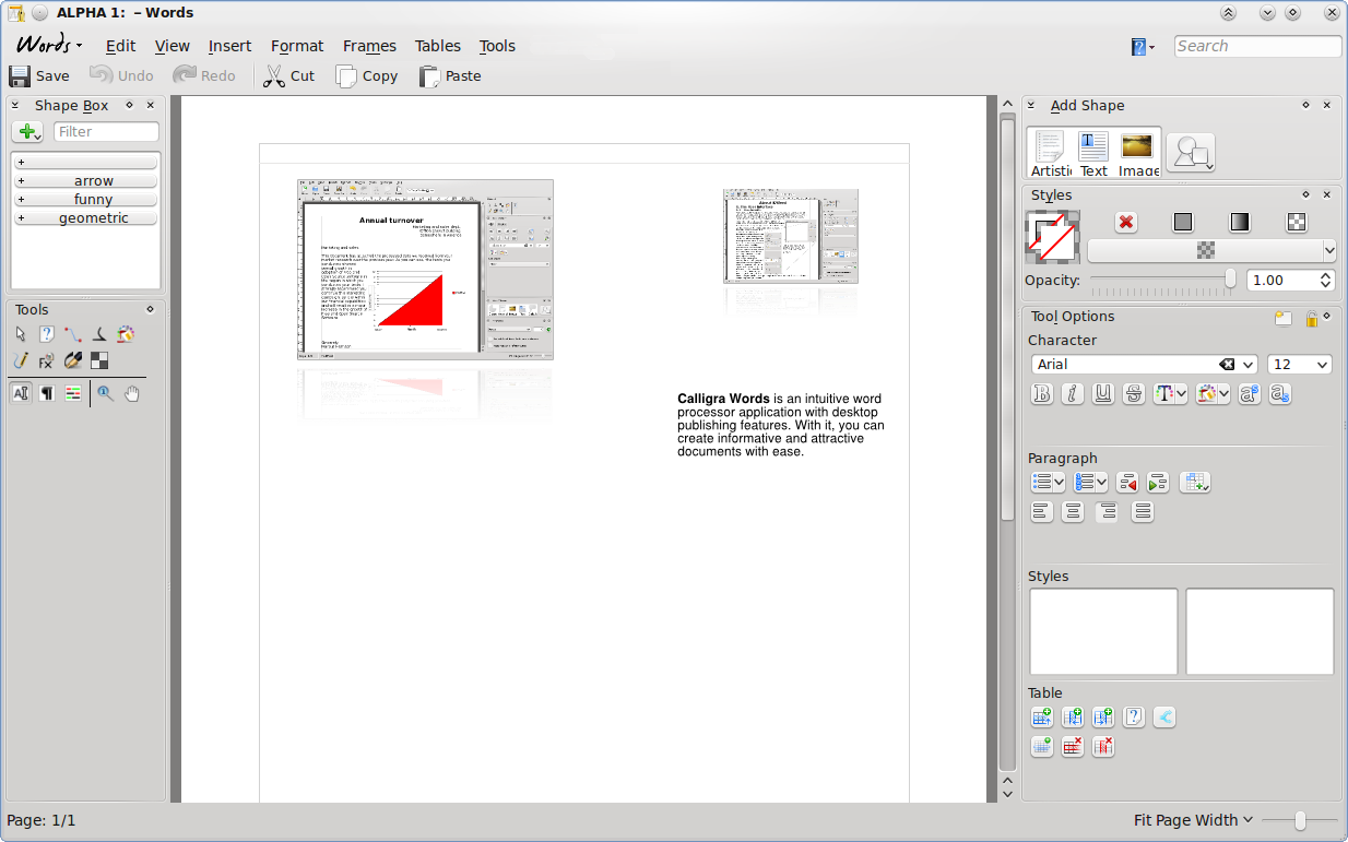
- I took opportunity to simplify the main toolbar (it's demonstrated on mockup below):
- removed less frequently used buttons "new document" and "open document" actions, so they are only available in the Words menu
- Moved help menu to the far right near the Search entry, replaced it with just an icon and drop down indicator to make it less intrusive
When menu is hidden, only "Words" button is visible:
Variant of the 3.1 mockup: "Words" button's frame has been completely removed, so the button looks and feels like other menu items.
It is possible to set up auto-raise behaviour for the button (i.e. using QToolButton::autoRaise property).
Startup view mockup 4: templates page
- The page has consistent look with the "Recent Documents" page
- There is a lot of place to display previews of templates instead of icons (as in the Recent Documents page)
- There is a lot of place for further extensions, e.g. displaying GHNS templates
- Idea: add "Recent templates" item
- Template grouping uses the same technique as the "Recent Documents" page
- Compare to [2]
Page displayed when user clicked "New..." command:
Startup view mockup 5: Kexi
Kexi uses tabbed toolbar in series 2.x. Currently it offers first and second tab with items as follows:
- "Kexi" tab with items: Configure, Configure shortcuts, About, About KDE, Quit
- "Project" tab with items: "New", "Open", "Close"
If Kexi moves to the proposed file menu with consistency in mind, natural action is to merge the actions from both tabs into the "File" menu. The tab would be called "Kexi", just like it's called "Words" in Words app.
TODO: mockup.


