Amarok/Archives/Alternative Playlist View
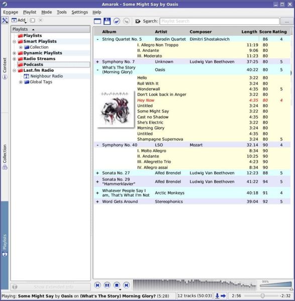
This proposal is for an alternative version of the Amarok playlist view. It works by placing the track information underneath the row for the album as shown in the mock-up below. This helps to reduce clutter - particularly when one plays mostly albums rather than individual tracks. This is often the case for classical music, where an "album" is often a piece of work (e.g a symphony) containing multiple movements (tracks).
This playlist view has an additional benefit of taking up less space, as a separate column for the track's title is not needed. A third benefit is the ability to rate Albums rather than tracks. Again, this makes particular sense for classical music, where tracks (movements) are often just part of a composition and not stand alone works.
The album's tracklist is collapsible using the expand / collapse button - like in a filesystem's Tree view. Auto-expand would expand the album's tracklist when that album is being played.
Proposal is for Amarok 2.0, I welcome your comments..
NEW:
1.1 - Album Cover added where there is enough room, as suggested by Mogger.

Discuss here
