Plasma/Active/Development/ActiveHIG/Drawers
Appearance
Guidelines for Drawers in Applications
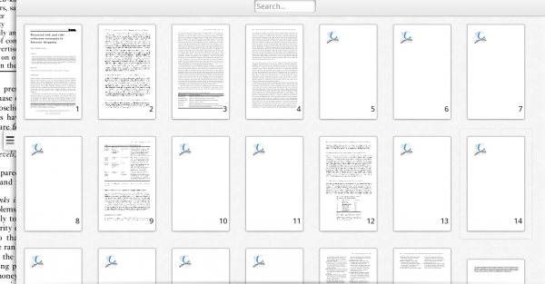
An Overlay Drawer
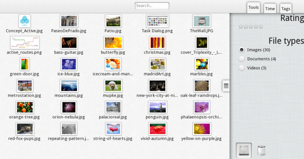
A Split Drawer
When to Use
There are two kinds of drawers: The Overlay Drawer and the Split Drawer.
- Overlay Drawers are used to expose additional UI elements needed for small secondary tasks for which the main UI elements are not needed. For example in Okular Active, an Overlay Drawer is used to display thumbnails of all pages within a document along with a search field. This is used for the distinct task of navigating to another page.
- Split Drawers are used to expose additional UI elements which are optional and can be used in conjunction with the main UI elements. For example the Resource Browser uses a Split Drawer to select different kinds of filters for the main view.
When not to use
Drawers are used for quick and simple interactions which need elements that are not present on the main UI.
- Put all elements needed for the application's main task(s) in the main UI
- For more complex tasks that are only executed after the user has completed multiple steps, use a Task Dialog
How to use
Handle
If an application uses an Overlay or Split Drawer which is currently not shown, a handle is displayed on the right edge of the screen (see screenshots). This handle, however is only a visual indicator of the drawer's presence. The drawer can be pulled out from any point on the screen's edge, not only from the handle itself.
Overlay Drawer
- When an Overlay Drawer is pulled out, it extends to its full width, usually covering most of the main UI. There must be enough space to the left of it to display the handle.
- The Drawer can be closed again by pushing it back to the right or simply by tapping to the left of the drawer.
- As soon as the Drawer's purpose (e.g. navigating to another page in Okular Active) is fullfulled, it closes automatically.
- The Drawer cannot be resized, its only states are opened or closed.
Split Drawer
- When a the handle of a Split Drawer is pulled to the left, the main UI is automatically resized so that both it and the Drawer can be displayed side-by-side.
- The drawer itself appears to be below the main UI, so the main UI is being dragged to the left to uncover the drawer.
- Both the Main UI and the Drawer can be interacted with at the same time.
- The Split Drawer stays open until the user closes it by pulling the Main UI over it again. It does not close automatically.
- If useful for an application, the drawer can be resizeable horizontally.
- It is possible to use tabs above a Split Drawer which switch between different sets of elements inside the Drawer.
- The tabs move up out of the drawer upon opening it and move back down upon closing. The do not move if the drawer is resized.
- When switching to another tab, the Drawer's content is switched with a horizontal sliding animation.
Code to Implement the Overlay Drawer
This won't work until the component is officially available
import org.kde.plasma.extracomponents 0.1 as PlasmaExtras

PlasmaExtras.OverlayDrawer {
    Text {
        text: "main content"
    }
    drawer: Text {
        text: "drawer component"
    }
}
Code to Implement the Split Drawer
This won't work until the component is officially available
import org.kde.plasma.extracomponents 0.1 as PlasmaExtras

PlasmaExtras.SplitDrawerDrawer {
    Text {
        text: "main content"
    }
    drawer: Text {
        text: "drawer component"
    }
}


