PIM/Akonadi/Logo: Difference between revisions
*>Nunopinheiro No edit summary |
*>Nunopinheiro No edit summary |
||
| Line 96: | Line 96: | ||
'''Name:''' Nuno Pinheiro & Thomas Mönicke <nuno at oxygen-icons.org><br/> | '''Name:''' Nuno Pinheiro & Thomas Mönicke <nuno at oxygen-icons.org><br/> | ||
'''Description:''' Work fruit of discussions with Thomas<br/> | '''Description:''' Work fruit of discussions with Thomas<br/> | ||
'''Link(s):''' [http://bp2.blogger.com/__JNFVYfijS4/SC6sCOw6kkI/AAAAAAAAAMg/UuL2RewmAL0/s400/fullcolor.png PNG] | <br/> | '''Link(s):''' [http://bp2.blogger.com/__JNFVYfijS4/SC6sCOw6kkI/AAAAAAAAAMg/UuL2RewmAL0/s400/fullcolor.png PNG] | [http://techbase.kde.org/images/e/e4/Akonadi2.svg SVG]<br/><br/> | ||
'''Preview:'''<br/>[[Image:akonadi2.png]]<br/> | '''Preview:'''<br/>[[Image:akonadi2.png]]<br/> | ||
Revision as of 13:55, 17 May 2008
Welcome to the Akonadi Logo contest. This is the place where you can add your logo. The Akonadi developers will decide which logo they like most and use that on the website, for Akonadi applications, etc. Be creative!
The winner will not only become famous instantly, but he (or she) will also receive a brand new (though dated) Canon Powershot digital camera kindly provided by KDAB !!!
Aron Stansvik
Name: Aron Stansvik <elvstone at gmail.com>
Description: I liked Sune's idea and made my own variation :) Colors can of course be tuned/discussed/skipped all together :) Below is blue, red and lime from Oxygen palette. This is a logo and not an icon.
Link(s): PNG | Inkscape SVG
Preview: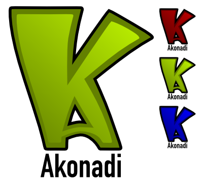
Flo
Name: Flo <flo at vdecine.net>
Description: Inspired by the Akonadi architecture :)
Link(s): PNG | Inkscape SVG
Preview:
Nuno
Name: Nuno <Nuno at oxygen-icons.org>
Description: The idea revolves about the classical sound of akonady the pim meaning human side of it, and the ribbon that can float your human side around in the wind/world, Maybe the monochrome version can also be made using the outer shapes of the face masked out towards the right, and not how it looks now :) yeah its a Nvidia logo didt saw that wen making it.
Link(s): PNG | Inkscape SVG
Preview:
ben
Name: ben <benadler at gmx.net>
Description: Inspired by Flo AND Nuno *g*
Wow, I managed to rip, rape and loot the work of two other submitters :) I didn't like Flo's colors and the gears. And instead of bitching about it... I think the mail icon looks better, but akonadi isn't just mail... Oh, and the outer borders are a little thicker, so it looks better when used as a small icon.
Link(s): Inkscape SVG
Preview:
Preview:
Michael H
Name: Michael H. <mhowell123 at gmail.com>
Description: Inspired by previous entries and the Konqueror icon.
SVG: 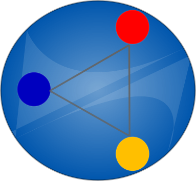
PNG: 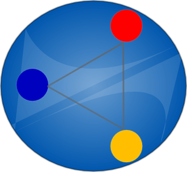
Aron Stansvik
Name: Aron Stansvik <elvstone at gmail.com>
Description: I also took a stab at the architecture + head idea. Head stolen from Nuno. If you take this, send the camera to Nuno as I don't need it, just want to help and my attempts at a head looked crappy :) I think minus the text and with some work, this could also work as a system tray icon.
Link(s): PNG | Inkscape SVG
Preview:
James F. Eby
Name: James F. Eby <thejames at unc.edu>
Description: I started with the idea in the announcement (A as the bottom of the K), but then moved the K so that the bottom leg was in line with the right side of the A. My A looked pretty good, but just that chilling with the k wasn't really enough to enter into a contest. I wanted to reflect the "under-the-hood" nature of Akonadi, and in so differentiate from a PIM Suite or a database app. I started throwing gears on there, but then it just looked like the KDE logo with a big A. So, after meditating on my big A, I began to see a Reuleaux triangle emerge, more specifically a Wankel engine. So I executed the concept visually, and this is the result.
Link(s): PNG | Inkscape SVG
Preview:
Thomas Mönicke
Name: Thomas Mönicke <tm at php-qt.org>
Description: It's inspired by the Akonadi architecture diagram and thus symbolizes the different API's and Applications that can be built using Akonadi.
It is also usable in various icon sizes.
Preview:
Lee Olson
Name: Lee Olson <leetolson at gmail.com>
Description: This logo was designed around the idea of PIM storage (symbolized by the book) which holds information such as bookmarks (represented by the bookmark), mail, phone numbers, calendars, and contact information.
I have also provided a preview of what possible tray icons could look like.
Colors are negotiable. SVG and/or other media available upon request.
Preview:
Roland Kempf
Name: Roland Kempf <kde at r-kempf.de>
Description: The logo combines the first two letters of AKONADI. Their arrangement symbolize a central instance for data storage.
The design of the logo was loosely inspired by the logo of Sune (cf. http://www.omat.nl/drupal/needed-akonadi-logo).
In its present form, it can be used as a system tray icon.
The icon can still be enhanced by gradients and such to "appeal" more and breath more "oxygen". But then, INAPID ("I'm not a professional icon designer"). Anybody interested in enhancing it, is welcome to do so and send it in for the contest under his/her name.
Link(s): PNG | Inkscape SVG
Preview:
Jaroslaw Staniek
Name: Jaroslaw Staniek <js at iidea.pl>
Description: This is semi-proffesional graphics created with logo in mind (not icon, so there's simplicity). Icon could be worked out based on the logo by the Oxygen Team I believe, as it is planned with the recent KOffice logos. The topics used in the design are "a" for Akonadi and the "infinity" sign for the rich data connectivity options available in the framework. The sign is also related to databases, important for the new PIM storage.
SVG and/or other media available upon request.
Preview:
(with text):

(32x32):
![]()
(22x22):
![]()
(16x16):
![]()
Nuno Pinheiro & Thomas Mönicke
Name: Nuno Pinheiro & Thomas Mönicke <nuno at oxygen-icons.org>
Description: Work fruit of discussions with Thomas
Link(s): PNG | SVG
Preview:
