Krita/Brushes Preset Preview: Difference between revisions
Appearance
< Krita
No edit summary |
No edit summary |
||
| Line 1: | Line 1: | ||
This document aim to provide '''standards | This document aim to provide '''standards''' propositions to unify the default brush preset icons of Krita , and ease the work of preset maintainers. | ||
== Default background == | == Default background == | ||
Revision as of 11:37, 21 July 2013
This document aim to provide standards propositions to unify the default brush preset icons of Krita , and ease the work of preset maintainers.
Default background
The default background is a neutral grey gradient, of 200px X 200px

Placement of elements
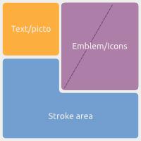
A preview icon is composed of 3 main blocks :

- Text/Picto area : a zone to write or use little picture
- Stroke area : a preview of the brush stroke itself
- Emblem/Icon : a visual to ease memorization of the brush
Stroke area
The brush preview feature a mini representation of the stroke. This stroke is colored with those color codes :
- Black is "normal"
- White is "erase" ( note : Checker pattern representing alpha too )
- dark blue is color-smudge smearing mode ( note : little gradient in the stroke to a warmer color can helps )
- purple is color-smudge dulling mode ( note : little gradient in the stroke to a warmer color can helps )
- light-blue for smudge-only
- FX presets can use distinct colors according to the fx-related resulting color
Note : The stroke can be exaggerated to boost the particular aspect of a brush.
Emblem / Icon
A little icons/emblems pasted on the "brush preset preview" ease the selection for user with a visual memory. It also make the UI more user friendly
Here are the guidelines for default placement of the emblem icons :
