Plasma/Plasma UX improvement project: Difference between revisions
Janamajeed (talk | contribs) |
|||
| Line 37: | Line 37: | ||
We found that the keys on the current keyboard design were too narrow for people who might have larger fingertips than normal. They would sometimes hit the wrong key when they were trying to press the one adjacent to it. | We found that the keys on the current keyboard design were too narrow for people who might have larger fingertips than normal. They would sometimes hit the wrong key when they were trying to press the one adjacent to it. | ||
There were also some keys that we deemed unnecessary | There were also some keys that we deemed unnecessary to have present on the main touch keyboard. Keys like the semicolon (;), apostrophe (‘), backslash/slash (/, \) and the brackets ([]) could be removed from the main keyset and accessed via the special symbols keyset which already exists. The Tab-key, for example, sees very little use to be included in this design. Its function can be emulated by touching the text field, for example. The spacebar is also very long and takes up quite a lot of space on the keyboard, and could be shortened. | ||
One of the things we were concerned about was the obstruction of the screen when using the keyboard. On the original, one could tap the arrow button to anchor the keyboard to the top or the bottom of the screen. We could not think of why anyone would use the keyboard on the top enough for this to be included, and removing the arrow icon can free up horizontal space on the keyboard. | One of the things we were concerned about was the obstruction of the screen when using the keyboard. On the original, one could tap the arrow button to anchor the keyboard to the top or the bottom of the screen. We could not think of why anyone would use the keyboard on the top enough for this to be included, and removing the arrow icon can free up horizontal space on the keyboard. | ||
Revision as of 12:11, 29 March 2012
About
Plasma UX improvement is a student project undertaken by a group from The Norwegian School of Information Technology in Oslo, Norway. The project is organized as a part-time internship at Nokia Qt Development Frameworks in Oslo. The project started in January 2012 and will finish in mid May 2012.
Goal
The goal of the project is to analyze the Plasma Active User Interface, identify elements with potential for improvement, and create prototypes of alternative solutions with the goal of improving user experience.
Areas of Focus
The project has chosen to focus on some key elements of the interface. The elements chosen are all central ones which most users will interact with frequently. Suggestions for improvements are based modern theories of user interface design for touch devices.
Browser
- Touch response from interface elements
- Set-up based on Activity
- Icon conventions
- Touch scroll and zoom
Keyboard
- Keyboard design document below
Peek&Launch
- Drag and snap functionality
- Tap and double-tap function
Activity Selection
- Opening adjustments
- Size of activity area
- Tap to open
Note: This page will be updated as work progresses, and code will be made available.
Keyboard Design Document
Introduction
This document will cover the design aspects in-depth for the new keyboard, which is planned for prototyping and implementation on the MeeGo-based WeTab tablet computer.
Issues with the current keyboard design
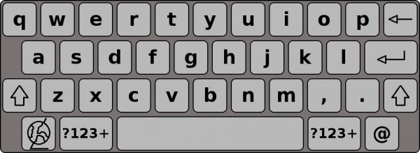
We found that the keys on the current keyboard design were too narrow for people who might have larger fingertips than normal. They would sometimes hit the wrong key when they were trying to press the one adjacent to it.
There were also some keys that we deemed unnecessary to have present on the main touch keyboard. Keys like the semicolon (;), apostrophe (‘), backslash/slash (/, \) and the brackets ([]) could be removed from the main keyset and accessed via the special symbols keyset which already exists. The Tab-key, for example, sees very little use to be included in this design. Its function can be emulated by touching the text field, for example. The spacebar is also very long and takes up quite a lot of space on the keyboard, and could be shortened.
One of the things we were concerned about was the obstruction of the screen when using the keyboard. On the original, one could tap the arrow button to anchor the keyboard to the top or the bottom of the screen. We could not think of why anyone would use the keyboard on the top enough for this to be included, and removing the arrow icon can free up horizontal space on the keyboard.

Fig.1: The existing keyboard design in Plasma Active, showing the lower case letters
What could be improved?
With issues from the current design in mind, what are we going to improve with our own keyboard design?
- Improved keyboard for Plasma Active design notes
- Prevent keyboard from blocking too much content
- More intuitive way of moving the keyboard around
- Grab and drag to a custom position
- Touch-friendly keys
- Can be used by both children and adults without difficulties
Note that every image below this point is from a prototype in development and is not to scale. Appearance and layout may be changed in the final version.
How it's used
Whenever you touch an area on the screen where you can input or edit text, the keyboard will show up on the lower half of the screen. It can then be used like any touch keyboards; you press keys to manipulate the text edit area on the screen. Multiple keysets like symbols, numbers and accented letters are accessed by pressing the appropriate key on the keyboard.
The keysets
The main keyset you will see when the keyboard appears is the one with lower-case letters. This uses the QWERTY-layout, as most people are familiar with that type of layout. This is considered to be the default layout.

Fig.2.1: The keyboard in its default (lower case) keyset
Shift/Caps-lock
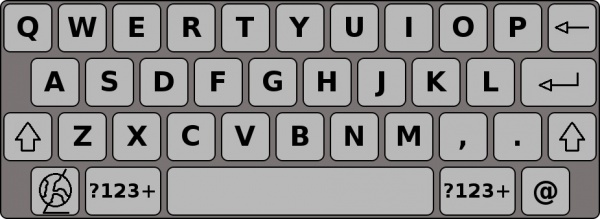
If you touch either of the shift-buttons (the buttons marked with an upward arrow) once, you will transform the lower-case letters into upper-case letters until you press a key. The upper-case letter will be entered into the text area and the keys will return to their lower-case state.
If you double-touch the shift keys, you will activate caps-lock. The keys will stay upper-case until you turn it off by touching either of the shift buttons once.

Fig.2.2: The upper case keyset
Numbers and symbols
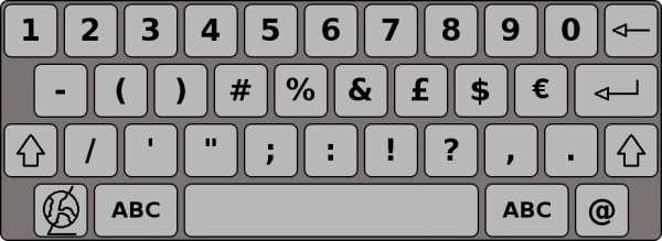
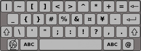
If you touch either of the buttons marked “?123+” once, the keyboard layout will change to display the numbers 0 to 9 and a variety of symbols. While this layout is active, touching the shift buttons will toggle the keyboard layout to display even more symbols. Touching the button marked “ABC” will change it back to the standard letter layout.

Fig.2.3: The numbers keyset with a few frequently used symbols

Fig.2.4: The symbols keyset shown when you press shift while the numbers keyset is active
