Design/Wallpapers/Wallpaper design guidelines: Difference between revisions
Appearance
m Ngraham moved page Wallpaper design guidelines to Wallpapers/Wallpaper design guidelines |
m Ngraham moved page Wallpapers/Wallpaper design guidelines to Design/Wallpapers/Wallpaper design guidelines |
(No difference)
| |
Revision as of 16:39, 19 December 2024
Wallpapers are functional art. A wallpaper not only has to look good, but also keep looking good as the user covers it with files and folders, widgets, and windows, and also not become distracting. Finally, it needs to communicate how the user should feel while using the software. Serene? Cool? Safe? Excited? Professional? Playful? etc.
Technical requirements:
- CC-BY-SA-4.0 license
- PNG file format
- Three sizes: 5120x2880 (normal desktop), 7680x2160 (ultrawide desktop), and 1440x2960 (mobile)
- Light and dark versions of each size
Functional requirements:
- Must be original. You can take inspiration from others' work or from concept art (AI-generated or otherwise), but the final piece must be your own original work, not created using generative AI.
- Not too visually busy. Fine details attract attention, obscure desktop icons' labels, and generally the whole composition looks worse the more things cover it up. Prefer big shapes to small ones. In particular, preserve a mostly open area at least in the top-left quadrant, but ideally the whole top 1/3 of the image. This is the most common area for desktop icons to be placed, so it needs to be especially suitable for being obscured by the user's stuff.
- Not too light or too dark. Screens vary in their ability to display adequate contrast for very light or dark colors, so avoid them. Though we want a light and a dark version of the wallpaper, the light one shouldn't be too light, and the dark one shouldn't be too dark.
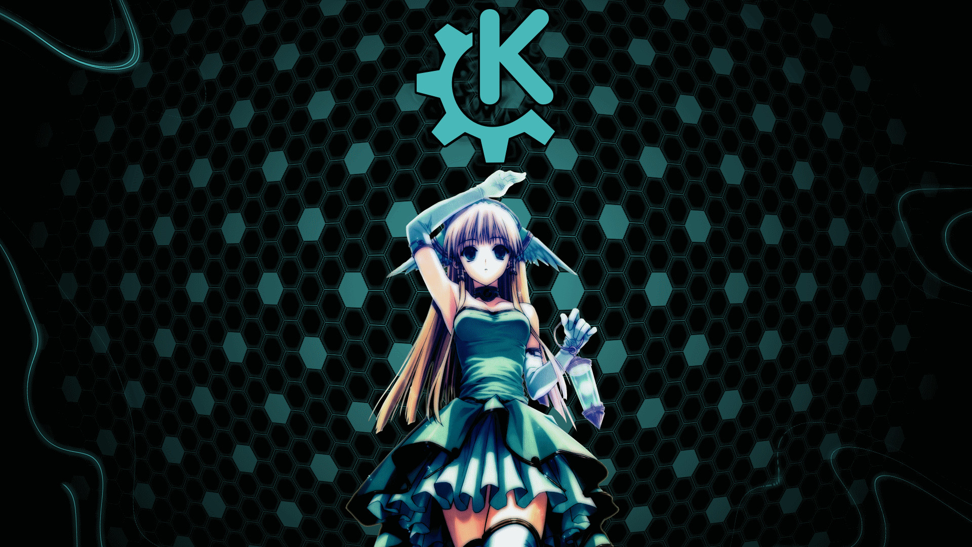
- No text or logos. It should stand alone, and not need to yell "this is a KDE Plasma wallpaper!" at the viewer.
Style recommendations:
- Limited color palette. Stick to shades of one or two main colors. Any more than this and the image becomes too attention-getting. A third color is okay if it's used sparingly as an accent.
- Medium-bright colors. KDE is about energy and excitement, and bright colors communicate those better than muted, desaturated, or pastel colors. In particular, avoid muted brown, yellow, and green colors that are associated with illness and bodily functions. But don't go overboard and use super-saturated colors, either!
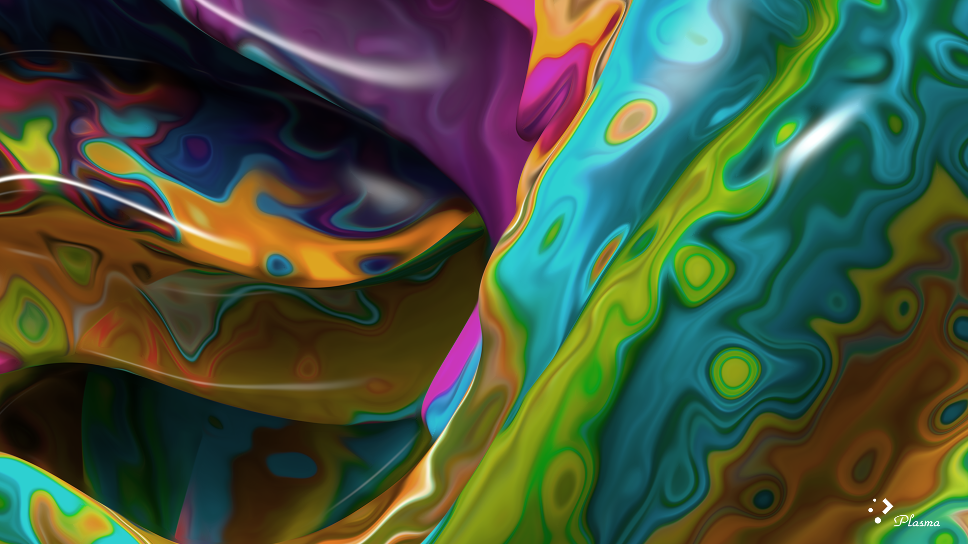
- Matte, not shiny. Hard specular highlights makes something look plasticky, artificial, fake, and amateurish. Even obviously artificial elements with a shine should be textured more towards the matte end of the spectrum.
- Not childish or immature. Though KDE has a playful side, we don't want to connote childishness. No cartoon characters, anime stuff, or anything excessively cutesy.
- "Humane", "empowering", and "cool". Take inspiration from these adjectives!
Note that there's no requirement to follow the style of previous wallpapers; feel free to explore new styles. At the same time, following an older style is fine as well, if that's what you want.

