KDE Visual Design Group/KirigamiHIG/CommandPatterns: Difference between revisions
Added dialog section |
Merged primary and secondary action button sections, added image |
||
| Line 3: | Line 3: | ||
These patterns help you with deciding from where in the user interface a command should be executed. | These patterns help you with deciding from where in the user interface a command should be executed. | ||
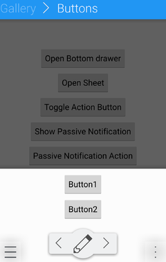
'''Primary Action''' | '''Primary Action and Secondary Actions''' | ||
[[File:Action_Buttons.png | 240 px ]] | |||
If there is a clear primary action on a given page which is not not directly related to a specific element on screen (e.g. creating something new, or editing the currently viewed element), use a [[/ActionButtons | Primary Action Button]] | If there is a clear primary action on a given page which is not not directly related to a specific element on screen (e.g. creating something new, or editing the currently viewed element), use a [[/ActionButtons | Primary Action Button]] | ||
If there are two actions which are almost as frequently used as the primary action and not related to a specific element on screen, use two [[/ActionButtons | Secondary Action Buttons]] to execute them. | If there are two actions which are almost as frequently used as the primary action and not related to a specific element on screen, use two [[/ActionButtons | Secondary Action Buttons]] to execute them. | ||
Revision as of 14:31, 16 June 2016
Command Patterns
These patterns help you with deciding from where in the user interface a command should be executed.
Primary Action and Secondary Actions
If there is a clear primary action on a given page which is not not directly related to a specific element on screen (e.g. creating something new, or editing the currently viewed element), use a Primary Action Button
If there are two actions which are almost as frequently used as the primary action and not related to a specific element on screen, use two Secondary Action Buttons to execute them.
Toolbars
TODO: Images
In desktop user interfaces, if you have several often-used controls, put them in a toolbar.
Controls within content
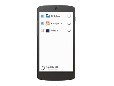
TODO: Image for desktop
If controls are directly necessary for the primary tasks of an application and are directly related to other elements on the screen, place them directly in the main user interface.
On-Demand controls

TODO: Image for desktop
If the main task for a list is selecting an item, but users often perform "quick actions" on a single list item, use on-demand controls, which are shown on mouse-over in pointing device oriented interfaces, and via a "slide-to-reveal" handle in touch-based interfaces.
Global Controls
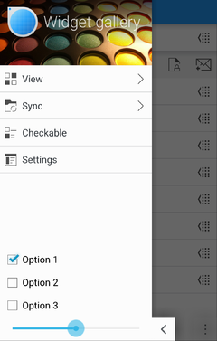
Put actions which should always be available, independent of the current context, in the Global Drawer.
Contextual Actions
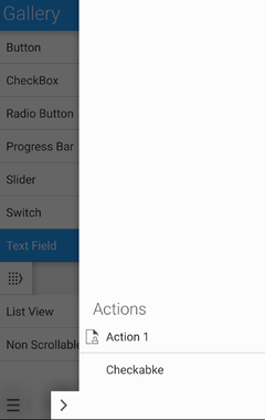
In a phone or tablet user interface, put actions which are only relevant in the current context and which are not common enough to warrant permanently occupying screen space with them in a Context Drawer
Showing dialogs
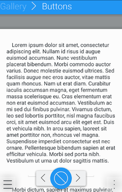
For a full modal dialog, use a Dialog Sheet
For a quick choice, use a Bottom Drawer

