Amarok/Proposals/Context Menu Proposal: Difference between revisions
| (One intermediate revision by the same user not shown) | |||
| Line 77: | Line 77: | ||
| -- spacer -- | | -- spacer -- | ||
|- | |- | ||
|Organisational tasks | |'''Organisational tasks''' | ||
|Album (if available) | |Album (if available) | ||
|Album | |Album | ||
| Line 98: | Line 98: | ||
|- | |- | ||
| | | | ||
| | |Organize Files | ||
| | | | ||
| | | | ||
| Line 107: | Line 107: | ||
| -- spacer -- | | -- spacer -- | ||
|- | |- | ||
|'''Deleting and removing''' | |'''Deleting and removing ''' | ||
|Delete Tracks | |Delete Tracks | ||
|Remove from Playlist | |Remove from Playlist | ||
|Delete | |Delete | ||
|} | |} | ||
Latest revision as of 14:22, 20 December 2012
Introduction
From the usability POV, our context menues have a serious problem. The placing of the same items at the same place in the Collection Browser context and the Playlist context is follows no apparent logic, and depending on the exact context, even within the same context (Collection Browser or Playlist) the ordering is not consistent, e.g. spacers appear and disappear without reason, the Edit Track Details option wanders up and down the menu, etc.
Current situation
Instead of explaining, let the screeshots talk:
| Collection Browser | Playlist | File Browser | |
| Artist | 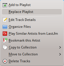
|
||
| Album | 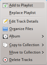
|
||
| Track | 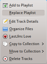
|
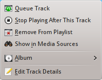
|
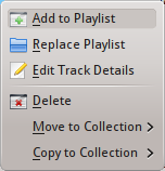
|
Proposal
As already stated in the http://community.kde.org/Amarok/Development/CardSortingPlaylistContextMenu analysis by Leinir and Lydia, there are too many items overall. It is rather difficult to remove items, but there are at least two that could be relocated:
Relocation possibilities
The Last.fm items could be relocated into a button.
The Organize Files option could be relocated in the Tools menu. Since this is a rather dangerous option anyway, it would be a bit out of sight, which is not a bad idea.
The Book mark action can be moved to a button.
Organisation possibilities
If we apply the [Comments] in the Card Sorting, the organisation should follow the same guidelines. This would result in the Edit track Details option sliding to the bottom, while the Delete Tracks would be somewhere in the middle (deleting or removing from playlist are similar actions, although not with the same result).
While this makes sense in the playlist, it doesn't make any in the Collection Browser. Currently, the users are probably more bothered by the items not being in the same place rather than the real location.
On the other hand, it would make sense to group the entries by actions and organisational tasks, separated by spacers, in all context menus, regardless of the location. Currently, the spacers are not always shown and don't seem to follow a precise logic (or at least one that is not obvious to me).
How about the following grouping: (I keep the items that could be relocated for now)
| Collection Browser | Playlist | File Browser | |
| Direct actions | Add to Playlist | Queue Track | Add to Playlist |
| Replace Playlist | Stop Playing After This Track | Replace Playlist | |
| last.fm action (if available) | Show in Media Sources | ||
| Bookmark this Artist (if available) | |||
| -- spacer -- | -- spacer -- | -- spacer -- | |
| Organisational tasks | Album (if available) | Album | |
| Edit Track Details | Edit Track Details | Edit Track Details | |
| Copy to Collection | Copy to Collection | ||
| Move to Collection | Move to Collection | ||
| Organize Files | |||
| -- spacer -- | -- spacer -- | -- spacer -- | |
| Deleting and removing | Delete Tracks | Remove from Playlist | Delete |
