Amarok/Development/Usability Improvements: Difference between revisions
Mayankmadan (talk | contribs) Created page with "Category:Amarok Category:Development Usability Improvements that have been agreed upon but have yet to be implemented are tracked here. == Playlist layouts == === La..." |
Mayankmadan (talk | contribs) No edit summary |
||
| Line 21: | Line 21: | ||
To clearly distinguish it from internal scrollbars, the global scrollbar should look like the thumbnail bar e.g. in Okular, with a rectangle (with correct relative height) with icon representing each widget. | To clearly distinguish it from internal scrollbars, the global scrollbar should look like the thumbnail bar e.g. in Okular, with a rectangle (with correct relative height) with icon representing each widget. | ||
[[ | [[File:Cv_mockup.jpg|Mockup of the scrollbar (without the icons)]] | ||
''A mockup of the "scrollbar" (right) without the icons. The blue frame represents the current view.'' | ''A mockup of the "scrollbar" (right) without the icons. The blue frame represents the current view.'' | ||
| Line 29: | Line 29: | ||
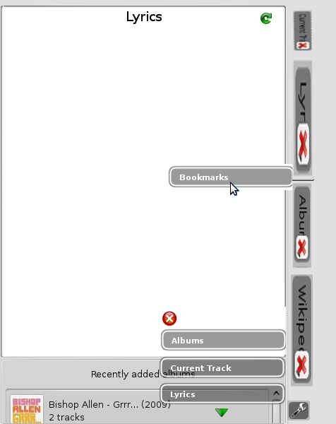
In order to avoid adding another element to the UI, the scrollbar should serve as a means to add, remove and move widgets to/from/across the context view. This would be done by pressing a wrench-button switches the scrollbar to "edit mode" and open a list of available windows to be dragged directly into the scrollbar. Widgets can be moved along the scrollbar in that mode as well as out of it to remove them. This would allow for a more direct way of manipulating the cv. The scrollbar has to change visually when the button is pressed to make clear where the configuration is done. This would make the horizontal nav/config bar obsolete. | In order to avoid adding another element to the UI, the scrollbar should serve as a means to add, remove and move widgets to/from/across the context view. This would be done by pressing a wrench-button switches the scrollbar to "edit mode" and open a list of available windows to be dragged directly into the scrollbar. Widgets can be moved along the scrollbar in that mode as well as out of it to remove them. This would allow for a more direct way of manipulating the cv. The scrollbar has to change visually when the button is pressed to make clear where the configuration is done. This would make the horizontal nav/config bar obsolete. | ||
[[ | [[File:Mockup_d&d.png|Mockup of the scrollbar in "Config mode"]] | ||
''A mockup of the scrollbar in "config mode" (sorry for the poor visual quality).'' | ''A mockup of the scrollbar in "config mode" (sorry for the poor visual quality).'' | ||
Latest revision as of 12:16, 10 December 2012
Usability Improvements that have been agreed upon but have yet to be implemented are tracked here.
Playlist layouts
Layout selection in the main window
A dropdown-listbox to select the playlist layout used will to be placed above the playlist. Next to it there is a wrench-button (labeled "Configure layouts") which opens the layout configuration dialog.
Layout configuration dialog
The layout configuration dialog allows to add, remove and configure layouts. The general layout will be according to KDE design pattern for administering objects, third example. A reference implementation can be found in kmail when opening Settings -> Configure filters. The list has the following buttons: + (add layout) - (remove layout). Selecting a layout from the list on the left displays it's configuration in the configuration area on the right. The content of the configuration area remains the same as the current configuration dialog. The Dialog has Cancel, Apply (replacing the Preview button in the current dialog) and Ok buttons.
- Note: nhnFreespirit is not sure yet if we can do without the Preview button. We should experiment with that once we have a working prototype.
Scrolling in context view
The current (svn) way of scrolling the widgets in the context view column is suboptimal since it is both horizontal and discrete whereas the widgets are laid out vertically and continuously. Using a normal scrollbar would raise the problem of having to scrollbars side by side when widgets have their own. gsteinert had the following idea to solve this:
Thumbnail-like scrollbar
To clearly distinguish it from internal scrollbars, the global scrollbar should look like the thumbnail bar e.g. in Okular, with a rectangle (with correct relative height) with icon representing each widget.
A mockup of the "scrollbar" (right) without the icons. The blue frame represents the current view.
Adding and (re)moving widgets using the scrollbar
In order to avoid adding another element to the UI, the scrollbar should serve as a means to add, remove and move widgets to/from/across the context view. This would be done by pressing a wrench-button switches the scrollbar to "edit mode" and open a list of available windows to be dragged directly into the scrollbar. Widgets can be moved along the scrollbar in that mode as well as out of it to remove them. This would allow for a more direct way of manipulating the cv. The scrollbar has to change visually when the button is pressed to make clear where the configuration is done. This would make the horizontal nav/config bar obsolete.
A mockup of the scrollbar in "config mode" (sorry for the poor visual quality).


